

Pantone Announces the Blending of Two Shades for 2016 Color of the Year
A Historic First
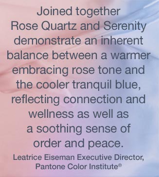
Pantone names Rose Quartz and Serenity as the 2016 Pantone Color of the Year. The 2016 selection marks the first time Pantone has chosen the blending of two separate shades as the Color of the Year.

Blurring Gender Roles in Wider Fashion World
Pantone explained that the cool blue of Serenity and the warm pink of Rose Quartz combine to create an easing sense of order and calm. Pantone also noted that the decision reflects a broader gender blur in fashion. This blur is turn caused by an even broader social shift towards gender equality. The merging of a color traditionally associated with males and a color traditionally associated with females seemed to them a logical representation of our culture at large.

A Calm and Secure Combination
Rose Tone, independently, is a gentle tone, but one that displays a sense of calm and equanimity. Serenity is reminiscent of blue skies and evokes similar feelings of relaxation and weightlessness. Together the colors are intended to create an atmosphere of calm security.
Previous Color of The Year Selections
For those interested in a little bit of Pantone Color of The Year history, check out the image below displaying Pantone’s entire collection of top color predictions for the past 16 years. Do you feel that they have their finger on the pulse of color and design?

Tell us What You Think About Pantone’s Choice
How do you feel about Pantone’s choice? Will you be using these two colors together in your home? Do you think the choice of two colors was a brilliant shift from the norm, or just a convenient cop-out? Let us know in the comment section below, we at Savvy Home would love to hear your thoughts!